
How to Create Realistic Art Mockups for Selling Art Online
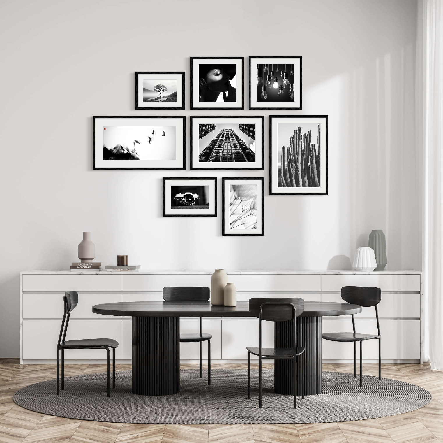
A recent ArtStage users thoughtfully put together collage.
A thoughtful art mockup does not simply place your work in a beautiful room. It helps a buyer understand its scale, presence and possible place in their life.
Online, even a powerful artwork can lose a little of its authority. Scale collapses, texture flattens, and a piece that commands a room becomes another rectangle on a screen.
A good art mockup restores some of that missing context. It allows a viewer to see how the work might sit above a sideboard, hold its own on a gallery wall or bring a quiet corner to life.
The goal is not to make the artwork appear grander than it is. It is to make it easier to understand. The best mockups feel almost effortless because the room, frame, light and scale are all doing the same thing: supporting the art.
Start with the artwork, not the room
The most beautiful interior cannot rescue an inaccurate image of the work.
Photograph the artwork straight on, with the camera parallel to its surface and the light as soft and even as possible. Reflections are especially unforgiving on varnish, glass and darker colours, so take a moment to check the image before moving on.
Crop to the true edges, straighten any perspective and preserve the original proportions. A square should remain square. A slender portrait should not quietly gain width because the wall has room for it.
Colour matters just as much. A little extra saturation may look appealing on screen, but the finished mockup should still resemble the physical work. Trust begins with accuracy.
Let scale tell the truth
Nothing gives away an artificial mockup faster than implausible size.
The temptation is understandable. A larger artwork is easier to see. But a 60-centimetre painting should not appear wider than a sofa.
Use the real dimensions whenever possible. When the room itself has no measurements, let familiar objects guide you. Doors, beds, desks and chairs all provide useful clues.
Then look at the composition as a whole. Is the work hanging at a believable height? Does it have enough space around it? Does its size make sense beside the furniture?
Small artwork can be intimate and desirable. It may look more convincing above a console, near a reading chair or grouped with another piece. Large artwork should feel expansive because it truly is, not because the mockup has inflated it.
Give the room a supporting role
A beautiful room can still be a poor setting for the artwork.
An elaborate chandelier, a remarkable view or a highly styled sofa may be visually irresistible, but the room should not become the subject of the image. Its job is to help the viewer imagine living with the work.
Choose a setting that suits the artwork’s mood, colour and visual weight. A quiet photograph may need clean lines and breathing room. A vivid abstract painting can often handle a more expressive interior. A small work may feel more at home in a hallway or bedroom than isolated on a vast wall.
Think about the likely buyer. Which setting would feel recognisable to them? Which one makes the work seem possible in their own world?
A simple test helps: notice where your eye lands first. The chandelier is allowed to be beautiful; it simply should not be the first thing you remember.
Good styling knows when to stop
Frames, mats and shadows can make a mockup feel finished, but they should never become louder than the artwork.
Try several frame options and look for the one that feels inevitable. A narrow timber frame may soften a painting. Black can give a photograph definition. A generous white mat can bring calm to a print. The right choice is often the one you notice least.
Shadows deserve the same restraint. A soft shadow can give the work depth and make it feel attached to the wall. A dark border around every edge tends to produce the opposite effect, making the artwork appear to float.
Follow the atmosphere already present in the room. If the light is gentle, the shadow should be gentle too. When an effect begins to announce itself, pull it back.
Look once as the artist, then as the buyer
Before publishing the mockup, step away from it. Return a few minutes later and look at it as someone encountering the work for the first time.
Does the artwork still resemble the original? Is the scale believable? Do the frame and room support it? Is it clear whether the frame is included in the sale?
A mockup should sit alongside, not replace, photographs of the physical work. Include a direct image, close-up details, dimensions, materials and framing information. One or two thoughtful room views will usually say more than a gallery of nearly identical interiors.
The purpose of the mockup is not to create a fantasy. It is to remove uncertainty.
Bringing it together with ArtStage
ArtStage was built for artists who want to create this kind of presentation without constructing every mockup manually. You can prepare your artwork, enter its dimensions, choose from more than 1,000 photorealistic interiors, customise frames and mats, arrange multiple works, import your own room and refine the lighting and shadows before exporting a high-resolution image.
The app makes the process faster, but the eye behind it still matters. An accurate artwork image, honest scale and a well-chosen room will always do more than elaborate styling.
When a mockup works, the editing disappears. What remains is the artwork, looking entirely at home.